目录
选择器
1、选择器的介绍
标签选择器 div { }
id选择器 #content { }
类选择器 .word { }
属性选择器 [title] { }
后代选择器 div span { }
子选择器(直接子元素) div > span { }
兄弟选择器(相邻兄弟) div + p { }
兄弟选择器(全体兄弟) div~p { }
交集选择器 div, .one { }
并集选择器 div.one { }
2、选择器的优先级
id选择器 > 类选择器、属性选择器 > 标签选择器
#content {
    background-color: blue;
}

.word {
    background-color: green;
}

[title] {
    background-color: yellow;
}

div {
    color: white;
    background-color: red;
    line-height: 80px;
    padding-left: 30px;
}
组合权重:
#hehe.hello > [title="xiaohei"].hello > div.hello
#hehe.hello {
    background-color: orange;
}

[title="xiaohei"].hello {
    background-color: green;
}

div.hello {
    background-color: red;
}
伪类
1、动态伪类
/* 未访问的链接 */
a:link {
    color: red;
}

/* 已访问的链接 */
a:visited {
    color: green;
}

/* 通过按下 Tab 键 导航到链接时触发。 或者按下鼠标左键松手后触发*/
a:focus {
    color: yellow;
}

/* 当鼠标移动到链接上 */
a:hover {
    color: blue;
}

/* 被激活的链接(当鼠标左键单击链接时,未松开) */
a:active {
    color: yellow;
}
2、结构伪类
 /* span元素 并且它是父元素中的第3个子元素 */
span:nth-child(3) {
    color: red;
}

/* 4n+2的可能值是2、6、10、14、18... */
span:nth-child(4n + 2) {
    background-color: yellow;
}

/* an + b */
/* a=-1, b=2*/
/* -n + 2的可能值是2、1 */
span:nth-child(-n + 2) {
    color: red;
}

span:nth-last-child(2n) {
    color: red;
}
属性的继承
可以继承的属性
line-height
font-size
color
text-align
.container {
    background-color: blue;
    height: 100px;

    line-height: 60px;
    font-size: 20px;
    color: white;
    text-align: center;
}

.container .sub1 {
    /* background-color: inherit; */
    background-color: green;
    /* line-height: 100px; */
}

.container .sub2 {
    background-color: red;
}
元素的分类
1、块级非替换元素
div、h、p、ul、li、table
独占父元素一行
高度默认由内容决定
可以随意设置宽高
.block-noReplace div {
    background-color: green;
    width: 200px;
    height: 100px;
}
2、行内非替换元素
span、a、strong
跟其他行内级元素在同一行显示
宽度默认由内容决定
不可以随意设置宽高
.inline-noReplace span,a,strong {
    background-color: red;
}
3、行内替换元素
img、input、iframe、video、audio
跟其他行内级元素在同一行显示
宽高由内容决定
可以随意设置宽高
.inline-replace img {
    width: 200px;
    height: 100px;
}
4、行内块级元素
本质还是行内级元素,对外行内,自身具有块级元素的特性
宽高由内容决定
可以随意设置宽高
.inline-block span {
    background-color: orange;
    display: inline-block;
    width: 200px;
}
重点元素介绍
img元素
<img src="example.jpg" alt="图片显示失败时显示的文案" style="width:300px; object-fit:cover;">
object-fit 属性:
用于指定图像如何适应其容器。常见的值有:
fill: 默认值,图像会被拉伸以填充容器。
contain: 图像等比例缩放,确保整个图像完全包含在容器内,可能会留有空白。
cover: 图像等比例缩放,确保容器被图像完全覆盖,可能会裁剪图像。
none: 图像保持原始尺寸,可能会溢出容器。
水平居中
1、块级 - 行内
.block-inline {
    width: 600px;
    height: 100px;
    text-align: center;
}
2、块级 - 块级
.block-block {
    width: 600px;
    height: 100px;
}

.block-block div {
    width: 300px;
    height: 50px;
    margin: 0 auto;
}
3、定位元素居中
.refer-abposition {
    position: relative;
    width: 600px;
    height: 100px;
}

.refer-abposition div {
    width: 300px;
    height: 50px;
    position: absolute;
    margin: auto;
    left: 0;
    right: 0;
    bottom: 0;
    top: 0;
}
4、定位元素居中:平移实现
.refer-abposition2 {
    position: relative;
    width: 600px;
    height: 100px;
}
.refer-abposition2 div {
    width: 300px;
    height: 50px;
    position: absolute;
    margin: 0 auto;
    left: 50%;
    transform: translateX(-50%);
}
vertical-align
vertical-align用来设置行内级盒子(inline-level box) 在 行盒(line box) 中垂直方向的位置
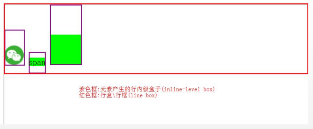
块级元素(block-level box) div,做父类
行盒(line box),盒高度:能包裹住行内级盒子的高度
行内级非替换元素 span
内级盒子(inline-level box),盒高度:line-height
行内级替换元素 img 内级盒子(inline-level box),盒高度:margin-box
行内块元素 display:inline-block 内级盒子(inline-level box),盒高度:margin-box
/* 与父盒基线对齐 */
vertical-align:baseline;

/* 与父盒顶部对齐 */
vertical-align:top;

/* 与父盒底部对齐 */
vertical-align:bottom;

/* 与父盒基线加X的一半对齐,并不能保证行内级盒的垂直居中 */
vertical-align:middle;

/* 还有其它取值 */
...
浮动
一、浮动的特点
1、浮动元素不能与行内级内容层叠,行内级内容将会被浮动元素推出
2、后浮动元素不能超过之前所有浮动元素的顶端
3、浮动之后会脱离标准流,不再向父元素汇报高度,父元素高度会坍塌
二、解决高度坍塌的几种不可取的方式
1、给父元素一个高度
2、overflow:hidden
3、父元素:inline-block
4、父元素也浮动(具有行内块的特点)
5、父元素变为绝对元素position:absolute;(具有行内块的特点)
6、在父元素最后增加一个块级元素
<div clear='both'></div>
clear 常用于非浮动元素避免与浮动元素重合,
clear = both;要求元素的顶部低于之前生成的所有浮动元素的底部
三、清浮动的方法
.clear-fix::after {
    content: "";
    display: block;
    clear: both;
    height: 0;
    /*兼容旧的浏览器*/
    visibility: hidden;
    /*兼容旧的浏览器*/
}

.clear-fix {
    *zoom: 1;
    /*兼容IE6~7浏览器*/
}
定位元素
一、介绍
static:默认值,在标准流
.static {
    height: 100px;
    width: 100px;
    position: static;
}
releative:不脱标,相对自己原来位置
.releative {
    height: 100px;
    width: 100px;
    position: relative;
    left: -20px;
}
absolute:脱标,相对最邻近的定位祖先元素
.absolute {
    height: 100px;
    width: 200px;
    position: absolute;
    bottom: 10px;
    right: 10px;
}
fixed:脱标,相对视口
/* fixed */
.fixed {
    height: 100px;
    width: 100px;
    position: fixed;
    /* left: 100px;
    top: 100px; */
    bottom: 100px;
    right: 100px;
}
二、子绝父相
常用的一种定位技术:子绝父相
子:absolute
父:releative
.father-relative {
    position: relative;
}

.absolute {
    height: 100px;
    width: 200px;
    position: absolute;
    bottom: 10px;
    right: 10px;
}
flex布局
一、flex container
下面这些属性都是用在:flex container上的
display: flex || inline-flex
flex-direction:row || row-reverse || column || column-reverse;
/* 水平方向 */
justify-content : flex-star || flex-end || center || space-between || space-around || space-evenly

/* 垂直方向 */
align-items: strech || flex-start || flex-end || center || baseline
/* 是否换行 */
flex-wrap:nowrap || wrap

/* 垂直方向:多行 */
align-content: strech || flex-start || flex-end || center || space-between || space-around || space-evenly
二、flex item
以下这些属性用在flex item上的
order
align-self
弹性增长
/* 默认值 */
flex-grow:0

总和不过1:
item的增长为:container剩余size * flex-grow

总和过1:
item的增长为:container剩余size * flex-grow / sum

几种场景:
总和不过1(占不满)
总和过1(占满)
全为1(占满均分)
只有一个为1(为1的item全占)
弹性缩小
/* 默认值 */
flex-shrink:1;

超出container的size * 收缩比例 / items的收缩比例之和
收缩比例 = flex-shrink * item的baseSize

几种场景:
总和过1(全部收缩)
总和不过1(部分收缩)
全为1(baseSize相同,均分收缩)
全为0(无收缩)
脱标汇总
一、汇总
float
1、不管是div/span/img脱标之后都具有了行内块级元素的特点
2、脱标之后不在向父元素汇报高度
3、清浮动解决父元素高度坍塌问题
position
1、不管是div/span/img 脱标(绝对定位:absolute,fixed)之后都具有了行内块级元素的特点
2、relative 不会脱标
3、脱标之后不在向父元素汇报高度
4、清浮动无法解决定位带来的父元素高度坍塌问题,此处给了父元素一个高度
flex
1、不管是div/span/img作为flex-item也都具有了行内块级元素的特点(非strech状态下)
2、父元素高度不会坍塌
二、纵向
flex独占父元素一行
position:absolute 在 float 之上
z-index
平面转换
平移
/* 平移演示 */
.content .pingyi {
    background-color: lightcoral;
    width: 100px;
    height: 100px;

    /* 所有的过度 都有动画 */
    /* transition: all 1s; */

    /* 指定 平移 才有动画 */
    /* transition: translate 1s; */

    /* transform 下指定的 过度 才有动画 */
    transition: transform 1s;
}
.content:hover .pingyi {
    /* translate: 100px 10px; */
    transform: translateX(100px) translateY(10px);
}
旋转
.content .xuanzhuan {
    background-color: lightcoral;
    width: 100px;
    height: 100px;
    /* rotate: 45deg; */
    /* transform: rotate(45deg); */
    transform: translate(100px) rotate(45deg);
}

.content .xuanzhuang-changecenter {
    transform-origin: left top;
}
缩放
.content .suofang {
    background-color: lightcoral;
    width: 50px;
    height: 50px;
    translate: 50px 50px;
    transition: all 1s;
    transform-origin: left top;
}
.content:hover .suofang {
    /* scale: 2; */
    transform: scale(2, 2);
}
平移+旋转
.content .xuanzhuang-pingyi {
    width: 100px;
    height: 100px;
    transition: all 2s;
}
.content:hover .xuanzhuang-pingyi {
    transform: translateX(500px) rotate(360deg);
    /* transform: rotate(360deg) translateX(500px); */
}
倾斜
.content .qingxie {
    background-color: lightcoral;
    width: 100px;
    height: 100px;
    /* transform:skewX(30deg);
    transform:skewY(30deg); */
    transform: skew(30deg, 20deg);
}
适配方案
一、rem适配
1rem的大小是屏幕宽度的1/10,以iPhone6来说就是37.5px
html字体标号的大小也是1rem
设计给出iPhone6上的设计图尺寸是60px,那么我们就应该写:width:(60 / 37.5rem);
这样在iPhone6上的尺寸就是:((60 / 37.5) * (375 / 10))px = 60px
这样在12pro上的尺寸就是:((60 / 37.5) * (390 / 10))px = 62.4px
达到了在不同尺寸的手机上进行缩放的效果
二、vw适配
1vw的大小是屏幕宽度的1/100,以iPhone6来说就是3.75px
计算方式与rem类似,达到在不同尺寸的手机上进行缩放的效果
vw 与 vh不能混用。比如一个375 * 667的屏幕和一个375*812的屏幕
绘制一个100px * 100px的div
在375 * 667手机:w:(100/3.75) * vm = 100px;h:(100/6.67) * vh = 100px;
在375 * 812手机:w:(100/3.75) * vm = 100px;h:(100/6.67) * vh = 121.7px;
在375 * 812手机上会发生变形
行者常至,为者常成!